
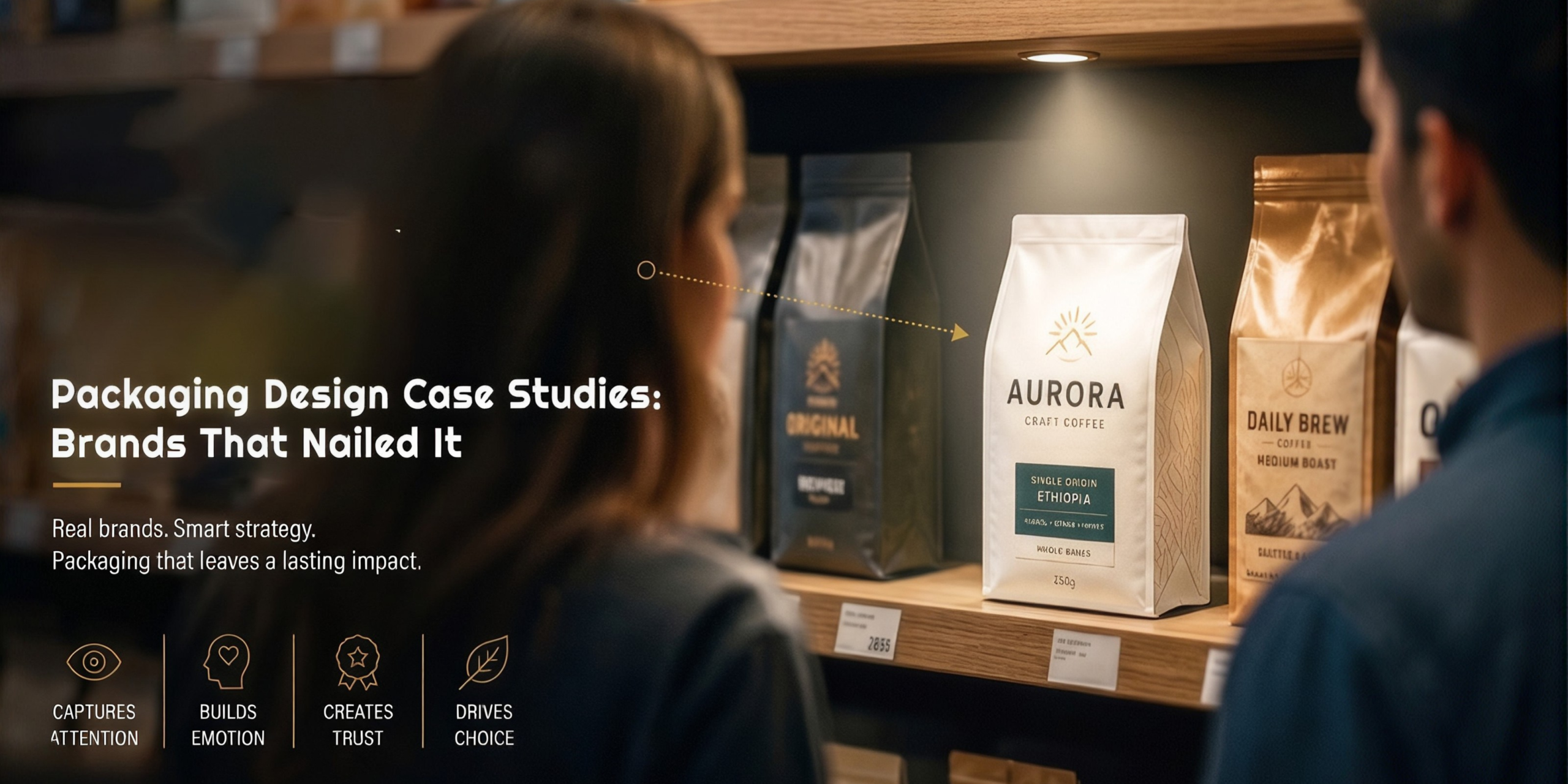
Packaging design acts as a visual ambassador for products seeking to captivate consumers in a crowded market place. Packaging has evolved into a powerful tool that influences consumer perception and purchase decisions. The first encounter consumers have with a product is usually through its packaging. That makes it a critical touchpoint in the buyer’s journey.
Effective packaging is a silent storyteller, communicating brand values, product attributes, and the promise of a unique customer experience. Factors that are important here are colour, form, typography and imagery. These are used in a variety of ways to evoke emotions, trigger recognition, and create a visual language that connects and resonates with the target audience.Packaging Design Case Studies: Brands That Nailed It
On top of this, packaging design has become a key component of marketing strategies. Packaging design influences consumer behaviour on both conscious and sub-conscious levels. A well-made package not only distinguishes a product on the shelf but also shapes perceptions of quality, value, and desirability. Another important aspect of packaging design is sustainability, as being eco conscious is more important than ever before.
Let us look at some creative packaging examples in the following packaging case studies. We will see instances of brand packaging success and how it plays a major role in adding to the reputation of a brand.
- Apple
When it comes to good design, you’ll always find Apple on the list of great examples. The brand is famous for its sleek looks and minimal designs that attract their customers by the masses. Apple’s packaging design creates a premium ‘controlled friction’ unboxing experience that acts as a marketing tool. It focuses on minimalism, sensory details, and sustainability. Key elements include rigid, high-quality boxes, slow-opening lids, and zero plastic, reinforcing brand value and sustainability.
- Amazon
Another creative packaging example from an innovative brand, Amazon also uses its product packaging to convey different messages to their customers. It optimizes their packaging for eco-friendliness and cost-effectiveness. Its frustration-free packaging initiative focuses on reducing waste. That makes it easier for customers to open their packages without using excessive materials. This design is aligned with Amazon’s eco-friendly commitments and has received positive feedback from environmentally conscious consumers.
- Coca-Cola
One of the most iconic and recognisable packaging, Coca-Cola very bottle shape evokes feelings of nostalgia from fans. Among these packaging case studies, this is the most memorable. Coca-Cola’s packaging design has played a crucial role in building a strong and enduring brand identity. The visual consistency of the packaging across different product lines increases brand recognition. There is also a deep emotional connection fostered by the packaging.
- Dove
If you want a brand that evokes a simple and clean aesthetic, then you’ll love Dove’s packaging design. It’s one of the creative packaging examples that really stands out. Soft colours such as white and pastels convey purity and gentleness. Clear communication of the product’s benefits, such as moisturisation and nourishment, is a part of the packaging design itself. Dove’s packaging is aligned with the brand’s focus on real beauty. It resonates with its target audience. This straightforward design communicates product attributes, which makes it easier for consumers to understand and trust the brand. The packaging is consistent and recognisable, and that contributes to Dove’s success in the beauty and personal care market.
- Subko Coffee
This brand is a little more local and less known but is still doing tremendous work with their design language. Subko’s visual identity draws on colours, textures, images, and typography that evoke the South Asian sub-continent. For example, to express the region’s linguistic diversity, Subko’s design language combines elements from Sanskrit, Anglo/Western, and Islamic typography.
Then take their packaging design of their coffee pack. Most artisanal coffee is sold in brown, gusseted bags but Subko’s coffee is sold in a box. The designer explored printed paraphernalia of the subcontinent, from posters to shipping labels. The pack label is instantly recognisable. Each label showcases scripts native to the area from where the beans are sourced. These are great creative packaging examples of using local elements to make a mark.
- Nutrico Delight
Similarly, we have worked on packaging design that has created high impact for our brands. For example, take Nutrico Delight. We worked with this flavoured milk brand. We went bold, and created vibrant splashes of colour, playful graphic elements, and a flexible visual system that adapted seamlessly across multiple flavours. Each SKU carried its own energy while staying consistent within the larger brand world. Our design direction focused on creating packaging that immediately grabbed attention in the cluttered dairy aisle while remaining clean, modern, and functional, creating brand packaging success.
- Dealishaa
Another notable example is our work with Dealishaa. This packaging case study is a masterclass on packaging design. The brand is a trusted name in the Indian grocery space. We turned every day packaging into every day elegance by centering our approach on clarity, category distinction, and timeless design language. The new packaging system we created was built on trust, transparency, and premium familiarity.
For grains and pulses, we used earthy colour palettes and subtle textural elements to evoke natural authenticity. Dry fruits and sweets embraced bold but minimal elegance, reflecting nutrition value and premium quality. For traditional mouth fresheners, we introduced vibrant tones and cultural patterns, infusing joy and festivities into the range. Each category follows a unified visual system, structured layouts, clean iconography, and crisp product imagery, allowing for easy recognition while keeping the overall brand architecture cohesive. The refined Dealishaa wordmark with its balanced typography exudes modernity, while Indian-inspired details ensure the brand remains grounded in its roots.
The overall packaging system makes the products easy to shop, snap, and stock, functional for everyday consumers, yet photogenic for digital-first retail.
Whether it is packaging done with balanced elements or loud and bold ones, you can see that good packaging goes a long way in connecting with the customer and enhancing brand identity. If you want your brand to stand out in a cluttered industry, reach out to us at White Warbler Communications. We will understand your brand and your needs and create the perfect packaging design that will not only enhance your brand but will communicate with your value to your clients and create brand packaging success.