
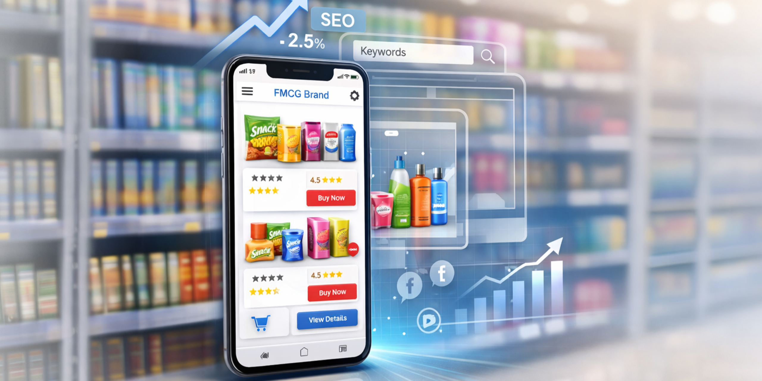
A whopping59.9% of the total global web traffic comes from mobile phones. It’s no surprise that brands and digital marketing services want to add mobile first website designs to their brand strategy. The modern day consumer expects seamless, fast and intuitive mobile experiences and for apps to perform impeccably on the smaller screen. Let’s find out more about mobile first design and why packaging companies should consider it.
What is Mobile First-Design?
Mobile-first design is an approach to designing websites or apps where developers create the mobile version of a website first, and then make the website suitable for larger screens.
It means:
- Designing for small screens, touchscreens, and limited bandwidth.
- Focusing on core content and essential actions.
- Then progressively adding features, layout complexities and enhancements for larger screens.
People do this because most internet users are on the phone. Plus, small screens force clarity and precision, and lead to faster load time. All this improves accessibility and usability overall.
What is Responsive Web Design?
Mobile first design is a strategy within responsive design and plays an important role in modern digital experiences, especially for social media marketing where most users interact through mobile devices. In responsive design, you could create a full desktop layout and then shrink it for mobile, but in mobile first strategy, you start by designing for mobile as the primary platform.
Responsive web design creates websites that adjust their layout, images, and functionality across all screen sizes and devices. These websites automatically adapt to different screen sizes and devices, including phones, tablets, laptops, and large monitors, using the same base code. A responsive website resizes and rearranges layouts based on screen size, ensuring images, text, and spacing are optimized for usability and engagement—key factors for effective social media marketing campaigns.
Why Do Brands Need Mobile-First Design?
Mobile first design is critical in today’s world. Going back to the earlier statistic, we can see that brands would be reaching out to a large number of people through mobile phones. Google itself has adopted mobile first indexing, which means they are using the mobile version of websites for ranking and indexing. Here are a few more reasons why going mobile-first is imperative for brands.
It Enhances User Experience
UX is at the heart of mobile-first design. It takes into consideration the mobile users limitations and designs around that. For example, a mobile phone user deals with a small screen, limited attention, touch, often slower networks, and being used with one hand. A designer would have to create a layout that goes around all that.
A designer would have to rank their content. They must decide what content would have to be visible, the design of the buttons, how to make the content light-weight and how to reduce cognitive load, amongst other things.
Impact On Business
Mobile websites that fail to provide smooth user experiences see higher bounce rates and lower engagement. Thus they have an impact on revenue, growth, and brand perception. Therefore it’s imperative that the experience is fast, clear and easy to complete with one hand.
Search engines use mobile-first indexing which means it’s the mobile experience which is getting evaluated. It means that even a great looking website can get ranked lower if their user experience is not up to the mark. Fast and usable mobile pages rank better.
There Are Technical Benefits
Mobile-first design makes teams build lean and efficient systems, which is especially important for online marketing where speed and performance directly impact user engagement. There are smaller payloads by default, and mobile-first starts with constraints, pushing teams to develop solutions that deliver quick, favourable results.
It also means that browsers can render meaningful UI sooner, apps stay interactive instead of freezing, media loading is more efficient, CSS architecture is cleaner, and caching and reuse are improved. Additionally, mobile-first design supports better scalability across devices and reduces performance risks as online marketing efforts grow and attract more users.
Why Your Packaging Brand Needs Responsive Web Design
Improved SEO Services
As we’ve mentioned, search engines rank using mobile first indexing. This is important when we take into consideration that most people are browsing and purchasing from their phones or tablets. That includes procurement managers, designers, and small business owners.
There are also many other ways that mobile-first designing boosts SEO. Mobile first design leads to faster load times which mean better rankings. There will be lower bounce rates on product and category pages. There is also stronger local SEO for packaging suppliers, clearer keyword intent matching, and better performance for image heavy SEO.
Enhanced User Experience and Engagement
Packaging buyers could be browsing samples on their phone, comparing materials during meetings, checking specs while multitasking, or sharing links with teams via WhatsApp or email. Mobile-first design supports this by making pages easy to scan and reducing whatever friction is there at every step.
There is also clear product storytelling on small screens and faster user experiences, and all that keeps users engaged. There is also better navigation through large product catalogues, which packaging brands generally have. All this builds confidence and trust, and encourages meaningful interactions.
Reduced Development Costs:
Focusing only on the essential components, brands create cleaner designs. That require fewer revisions and less back-and-forth between design, marketing, and production teams. Early testing on small screens also identifies issues before costly physical mockups or press proofs, minimizing expensive rework.
This also encourages modular, reusable assets—logos, icons, and typography that scale across SKUs, pack sizes, and marketing channels. This flexibility means designs can be adapted quickly for digital platforms, e-commerce, social media, or physical packaging without creating everything from scratch. Overall, mobile-first design streamlines the development process, reduces wasted effort, and speeds up multi-channel rollouts, saving both time and money.
In today’s world that’s focused on digital transformation, mobile-first design is no longer optional. It’s essential for packaging brands that want to stay competitive, flexible, and future-ready. From improving user experience and boosting SEO to reducing development costs and enabling seamless multi-channel rollouts, designing for mobile first ensures your brand performs flawlessly across every touchpoint, both digital and physical.
Don’t let outdated design hold your packaging brand back. Start thinking mobile-first today and create a website that not only meets your customers where they are but also sets your brand up for growth, innovation, and long-term success. Contact us now to transform your packaging brand’s digital experience and future-proof your design strategy.